Monday, February 28, 2011

GraphicRiver Rejection is Too High (for me)

I have been demoralized by GraphicRiver rejections due to their new standard of quality. I am doing not bad there, ranking 67 for total sales among all other artists, and I have only been there for a little over 6 months. Of course, the quality of my works are not top notch, but my portfolios are basically useful in the eyes of buyers - at least I think so. Buyers will buy stuffs that are more simple, useful and easy to work with. I have seen beautiful complex artworks that generate much lesser sales than expected.

Enough of the rant, and let me show you why I have finally given up on submitting new vectors to GraphicRiver. Below are some of the rejections I have gotten from GraphicRiver due to low quality.


I have to admit that it has been annoying to keep getting rejections after rejections, and sometimes I felt that they dislike me for personal reasons - yes, this is of course not the truth since a lot other designers has been getting rejection too, but it still hurt bad that you know you can earn so much more if they would have accepted those.

What GraphicRiver has been accepting recently are mostly cartoon characters, which we all know that are tough to produce and hardly any sales. Let me show you some example below from GraphicRiver.

http://s3.envato.com/files/1542754/1.jpg
Amazing artwork. Super, I must say.
2 sales in first 18 days.

http://s3.envato.com/files/1528359/retroframes-preview.jpg
Simple artwork.
5 sales in first 24 days.

http://s3.envato.com/files/1548946/1.jpg
Cute stuff and complex beautiful characters.
0 sales in first 16 days.

http://s3.envato.com/files/1568426/template.jpg
Simple silhouette.
4 sales in first 9 days.


As you can see from the above examples, simple silhouettes and common artworks tend to generate more sales than complex one. Not only this, but the time used into producing such a high quality artwork is so much more than simple silhouettes and yet the sales is much lower. We are in a business here so we need to factor in the time and revenue.

The truth is, GraphicRiver thinks that 18000 vectors/psd is a lot in their collection. I hope that they are more greedy and lower their standards to accept more vectors. I may be wrong in this case, and who am I to judge their direction since they have successfully build the Envato marketplace into a very unique site.

To me, GraphicRiver is not a microstock site. It is not a microstock site because they don't have enough vectors (stocks) for a designer to choose. Simply search for the keyword "kitchen" and it will only return you with 25 results.

I am rather disappointed in this situation because I know GraphicRiver is a gold mine, and yet I am unable to capitalize it due to my current skills. Having said that, I still have to give up on GraphicRiver and concentrate on other more lenient site like Shutterstock which LOVES ALL MY VECTORS and generate at least 10 times more sales than GraphicRiver does.

I hope that there would be a day that GraphicRiver suddenly wake up and realize that graphic designers need something more simple to work with, and not complex cute cartoon that can only fit into a story book. What so unique about stock site like Shutterstock is that they simply have EVERYTHING you need even though more than half of it are rubbish, but yet, there are still thousands of good one to choose from, right?

Tuesday, February 1, 2011

Tutorial: How to Draw a Clock Face with Adobe Illustrator?

Drawing a clock with Adobe Illustrator can be very difficult if you do not know the trick and technique. Here, in this tutorial, I will explain to you how to do it the simple way. 

First, draw 2 rectangles like the below. They must have the exact X coordinate. These rectangles will represent the hour of a clock.


Group them and Rotate it by 30 degree. Remember to use Copy function instead of just rotating it.


To repeat the rotation and Copy, go to Object > Transform > Transform Again. Repeat this until you get all the 12 rectangles.


Now, repeat the above steps for the minutes. Instead of rotating it by 30 degree, you should rotate this by 5 degree because these rectangles will represent the minutes. You may want to use a small rectangle for a better visual.


After you have successfully adding the minutes, you should now put the numbers. See the below for example. Remember, the number (text) should be Aligned Center. To do this, go to Window > Type > Paragraph.


 Using the same method, rotate the group by 30 degree to get the below.


Change all the numbers accordingly.


Now, you will have to rotate back the numbers to straight view. In order to do that, you will have to rotate them manually one by one using Object > Transform > Rotate. The below list may help you.

Hour 1 = 30 degree
Hour 2 = 60 degree
Hour 3 = 90 degree
Hour 4 = 120 degree
Hour 5 = 150 degree
Hour 6 = 180 degree
Hour 7 = 210 degree
Hour 8 = 240 degree
Hour 9 = 270 degree
Hour 10 = 300 degree
Hour 11 = 330 degree

After you have rotate them, you may notice that the alignment of the numbers and the clock are not accurate.


So, what you can do is to Expand the numbers into object. In order to do that, select all the numbers and go to Object > Expand. Once all your number is Expanded and Grouped, align them accordingly with the feature Window > Align. I believe you have no problem doing this, right?


To add the hands of the clock, draw the below. Yes, together with the blue circle outside the clock.


The usage of the blue circle is for you to rotate the hands. How you are going to do this is to Select both the circle and the hands - and Rotate them together.


My tutorial on how to draw a clock face ends here. If you have any question, please write in the comment :)

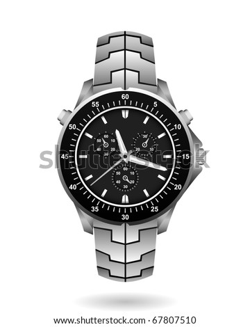
Below is an example of a vector watch I draw for IStockPhoto. For the details of pricing and number of downloads, please go to http://www.istockphoto.com/file_closeup.php?id=15216729